fund dashboard
Project
Designed an internal dashboard for employees to access key fund insights, offering both a high-level overview and detailed metrics.
Users & Needs
Regional Consultants (RCs) need quick access to fund information while selling to financial analysts. Product Strategists require detailed data to compare and position funds effectively.
Pain Points
Fund information was scattered across multiple applications, forcing users to switch between platforms, check the corporate website, or rely on other departments.
Provide fast, reliable access to all fund information in one place.
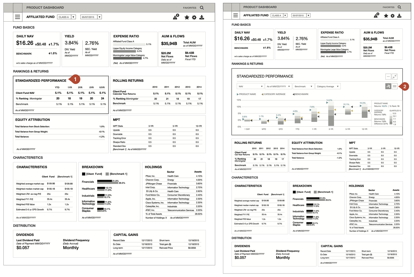
Two Personas, One Dashboard
The validated layout needed to serve two distinct user profiles within the same interface: a Product Strategist persona and a Regional Consultant persona, sharing one dashboard structure across desktop and mobile.
“While on a call, I need to find the fund’s current price, expense ratio, yield, etc…”
“I need to find where and why this product is doing best/worst compared to our benchmarks.”
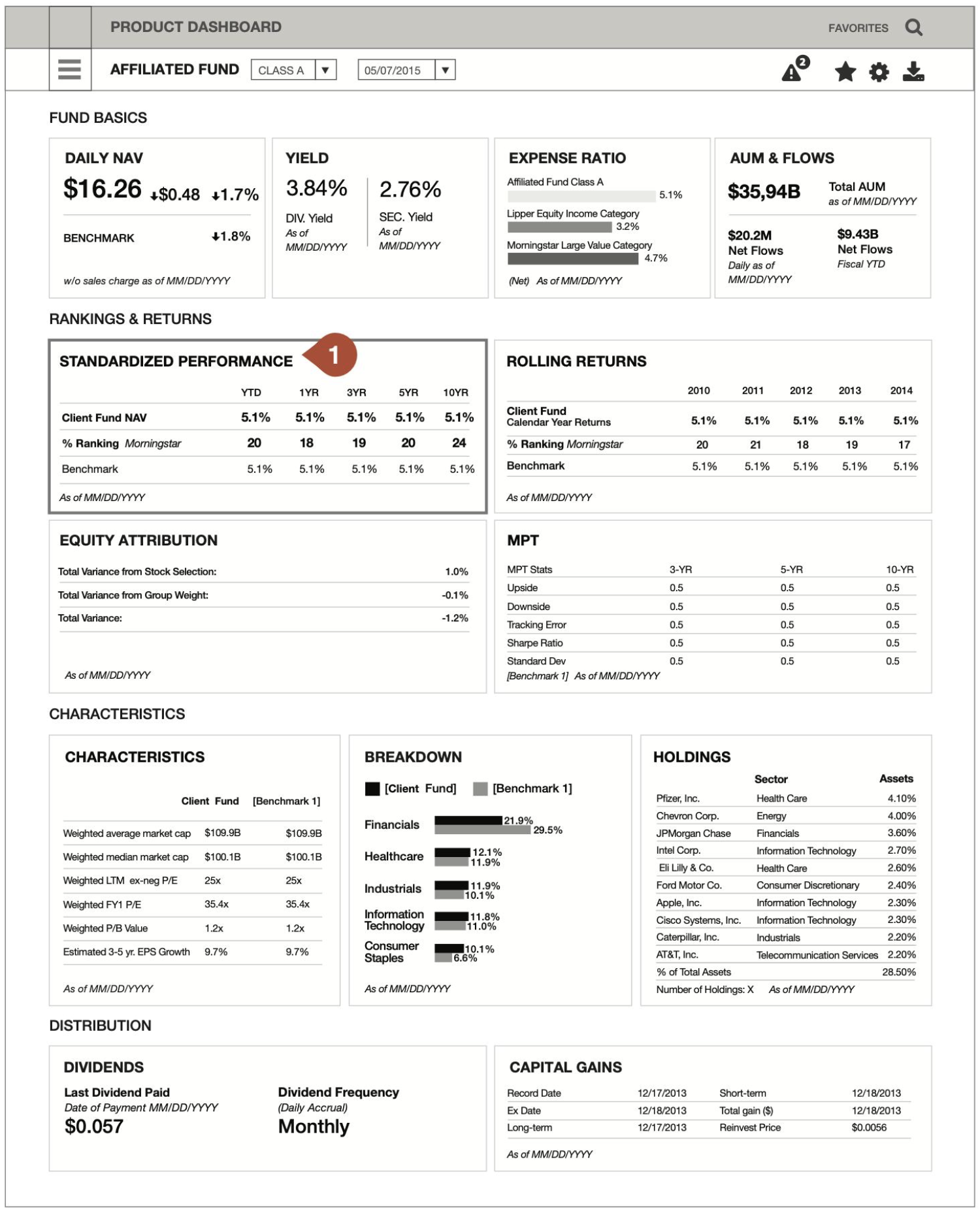
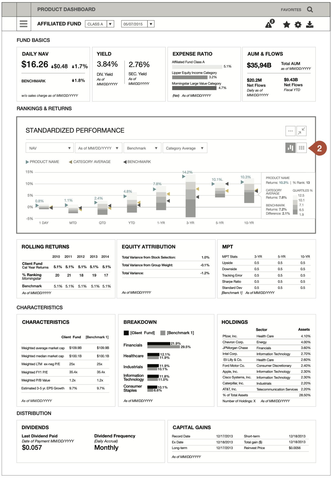
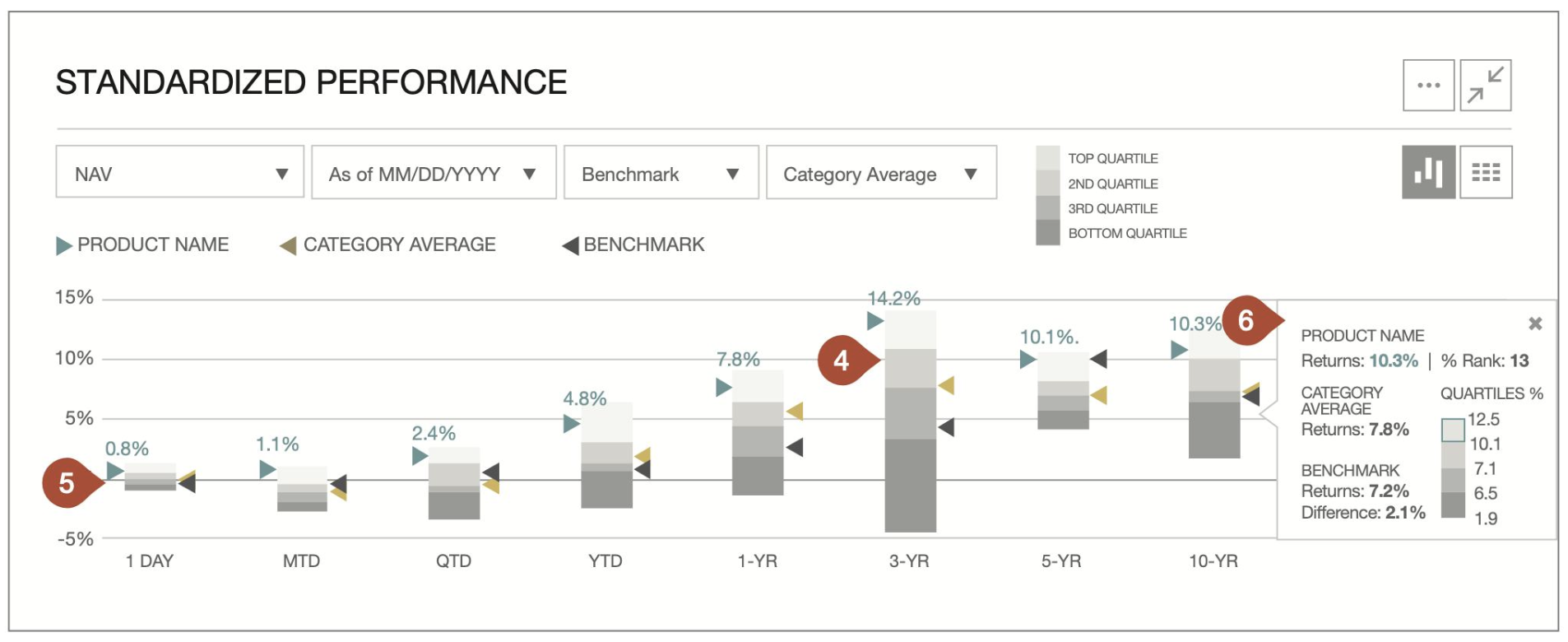
The same Standardized Performance data serves both personas, but the presentation changes with the question being asked. The Regional Consultant view keeps it as a compact table — fast to scan on a call. The Product Strategist view expands it into an interactive chart with quartile ranking bands — built for comparing performance against category and benchmark over time.
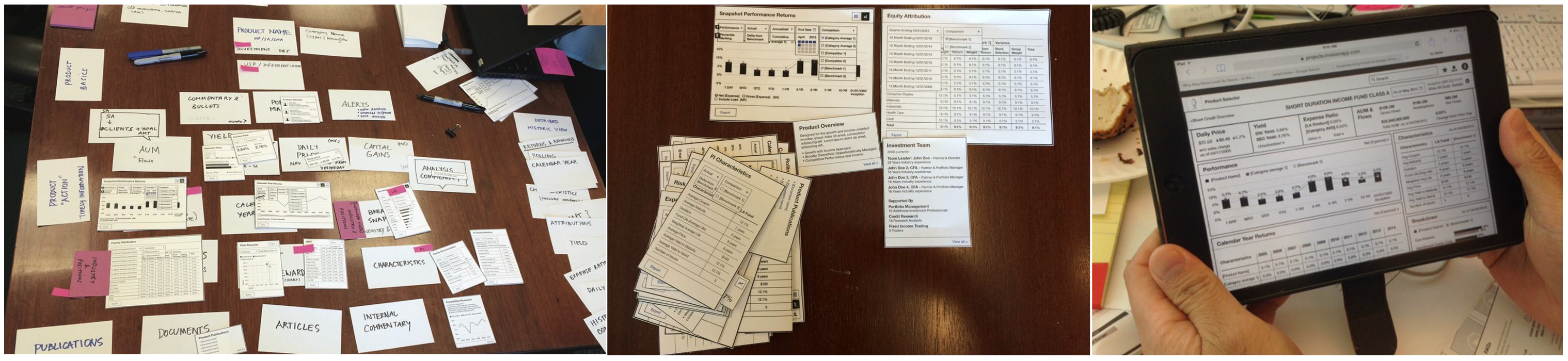
From Requirements to Validated Layout
We began by creating an initial set of component wireframes based on business requirements.
To validate content and information hierarchy, we developed paper prototypes and conducted card sorting sessions with different user groups.
Once the hierarchy and layout were refined, we built Axure and InVision prototypes for early user testing.
After validating the layout and components, we proceeded with designing the framework.
Two Charts, Two Analytical Questions
This chart displays a fund's historical price trends, and this one visualizes fund returns alongside its ranking among competitors — two distinct modes of analysis, trend vs. ranking, with interaction patterns tailored accordingly.
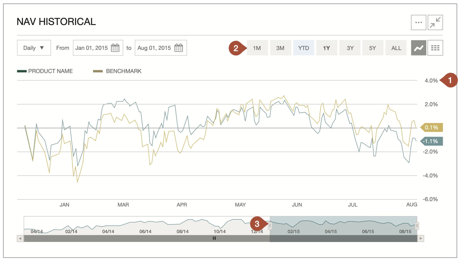
This chart displays a fund’s historical price trends.
1. The y-axis is positioned on the right to emphasize recent data. Users can view price changes at different time granularities (daily, monthly, etc.) and over long intervals (up to fund inception). A zoom function allows for deeper exploration, with multiple interaction options for different devices.
2. Users can adjust the timeframe using top buttons (1M, 3M, YTD, etc.), the navigator, or custom start/end dates, with all controls dynamically linked.
3. The navigator works well on desktops, while tablet users can tap buttons, drag the range, or use pinch-to-zoom for a seamless experience.
This chart visualizes fund returns alongside its ranking among competitors.
4. Floating stacked bars represent ranking quartiles, helping analysts assess whether a fund's position significantly impacts returns.
5. The 1D ranking period shows minimal variation, while the 3-YR period reveals a wider return range, making long-term rankings more meaningful.
6. Hovering or tapping displays detailed data for each period, including quartile ranges for better insight.