explainable ai explorer
Before a product relies on an AI prediction, someone who isn’t an ML engineer usually has to decide whether to trust it: a product owner, a domain expert, a reviewer. They need to understand why the model said what it said, without reading the model itself.
In products, explainable AI often means citations or reasoning steps in a chat. This project works a layer below that: explaining the prediction a model made.
I built a working explorer for that person. It runs on the Titanic dataset because the data is familiar and nothing real is at stake. The questions are the ones that matter in healthcare, lending, or insurance: why this prediction, is it consistent, and how do the models differ?
An explanation shouldn’t just tell people why a model made a prediction. It should give them ways to inspect, compare, and question its behavior.
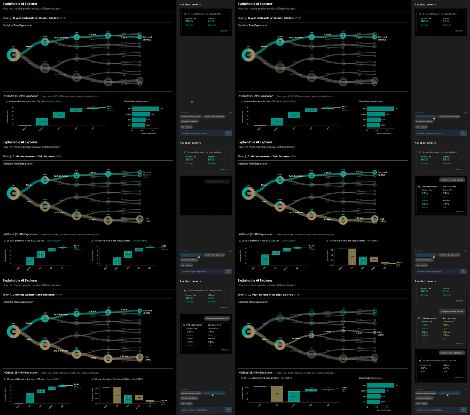
One passenger’s prediction, explained by two models, with a cohort-focused chat alongside.
Runs the actual models on Hugging Face Spaces, so the first load is slow while it starts up. Built with React, D3.js, FastAPI, scikit-learn, XGBoost, SHAP, and Claude Code.
Why the explorer shows two models
The explorer runs two models on the same passenger. They represent two different approaches to explainable AI.
A decision tree is interpretable: its rules are the model, so you can read exactly how it reached a prediction. XGBoost is explainable: it’s too complex to read directly, so a separate technique, SHAP, estimates how much each factor pushed the prediction up or down.
Showing them side by side creates a useful comparison. If two models produce similar results, what would someone need to see to understand how differently they reached them?
For a product owner or domain expert, that difference matters. Model choice isn’t only an accuracy question. It also depends on who needs to understand, check, and defend the result.

Reducing the translation between views
A tree and a SHAP chart describe a prediction in fundamentally different ways. The tree shows a sequence of rules. SHAP shows how much each factor contributed. Showing both creates another problem: people have to mentally translate between two different visual structures.
I designed the views as a coordinated explanation instead.
In the tree, the passenger’s path is highlighted while the other branches stay visible, showing both where this passenger went and where a different passenger could have gone.
The SHAP waterfall starts from the average prediction and adds each factor’s push, up or down, until it reaches this passenger’s result.
To make the two views read as one, highlighting a factor in one highlights it in the other, and both read left to right, from starting point to outcome.

Is this prediction part of a pattern?
Explaining one prediction still leaves an important question unanswered: does the same behavior hold across similar cases?
I used the tree itself as one entry point for answering that question. Selecting a leaf creates a cohort from every passenger who reached that leaf through the same path, turning the explanation into a way to explore the underlying population. Cohorts can also be defined directly by editing passenger characteristics, making it possible to compare specific groups.
The cohort makes it possible to see whether the selected prediction is typical of similar cases or an outlier.

Cohorts let people inspect similar cases. The what-if tool lets them probe the model directly: change one attribute and see whether the prediction—and its explanation—changes.
Because the models are actually running behind the interface, every change produces a new prediction and a new explanation. The prototype therefore supports experimentation rather than showing a fixed set of examples.

Setting the scope without closing the conversation
The explorer includes a chat for asking about passenger cohorts, with suggested questions such as “Compare women vs men” and “Children in 3rd class.” The suggestions show the kinds of questions the system is designed to answer, while the open field still lets people ask about other passenger groups.
I used the title, suggested prompts, and input text to establish the scope of the conversation rather than presenting a generic “Ask anything” interface. The goal was to make the system’s capabilities visible without limiting people to a fixed set of prompts.
A separate tutorial provides a more guided experience. It walks through a prediction one factor at a time, while the corresponding tree nodes and SHAP bars highlight. People can move through the explanation step by step or leave the tutorial and explore on their own.

Visualization provides the evidence; conversation helps people navigate it.
