songflow
My master’s thesis explored how visualization could make algorithmic recommendations easier to understand, evaluate, and control. I designed Songflow, an interactive visualization that used descriptive tags to explain music recommendations and let users inspect and refine the results.
The research was framed around recommender systems, but it explored questions now central to human-centered Explainable AI (XAI): what makes an algorithmic explanation useful, how much of the underlying model needs to be exposed, and how interfaces can help people understand and act on algorithmic output.
Core idea: an explanation can become an interactive layer between an algorithm and its user.
The problem
Recommender systems are often evaluated by the quality of their recommendations. But a good recommendation does not necessarily create a good user experience. Previous research had identified other factors that affect how people experience recommendations, including transparency, trust, control, and the ability to understand why something was recommended.
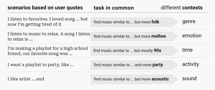
Music creates an additional challenge: people often have difficulty describing exactly what they want. They may think in terms of mood, context, instrumentation, or similarity — something upbeat, music for working, something with piano — rather than formulate a precise query.
That suggested a different interaction model: instead of requiring users to specify exactly what they wanted upfront, the system could provide recommendations and let them progressively inspect and refine the results.
Research into user needs
The research identified several needs that shaped the design. People often find it easier to refine alternatives than to describe exactly what they want. Genre alone is not enough: mood, instrumentation, context, period, and other attributes can all be meaningful ways of describing music.
Users also want to understand recommendations and retain some control over them. Explanatory information can help them evaluate recommendations without having to listen to every track, while filtering and revision make the system more inspectable. Because finding music is generally a low-effort activity, the explanation also had to remain lightweight.
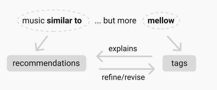
The key design decision was that the explanation could also become the interaction. Instead of simply telling users something about a recommendation, the attributes used to explain it could also be used to manipulate the recommendation set.
Designing Songflow
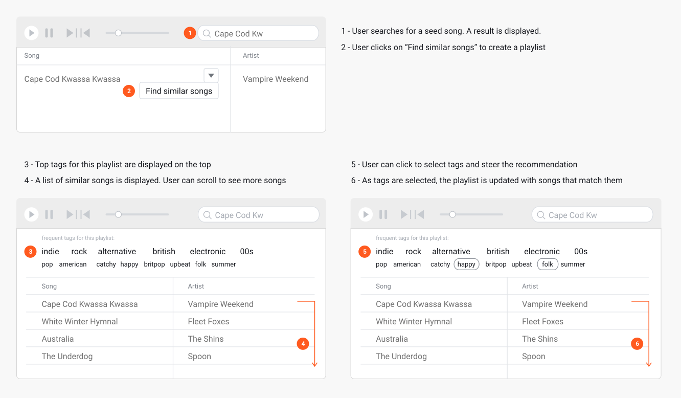
I explored multiple approaches for presenting relationships between recommendations and descriptive tags, including tag clouds, button-like tags, treemap-based concepts, and connected layouts.
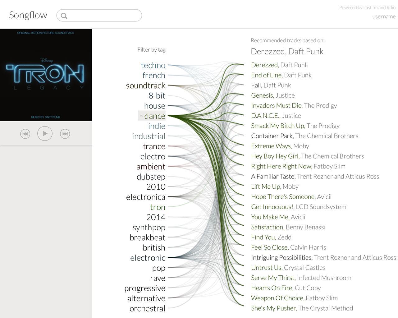
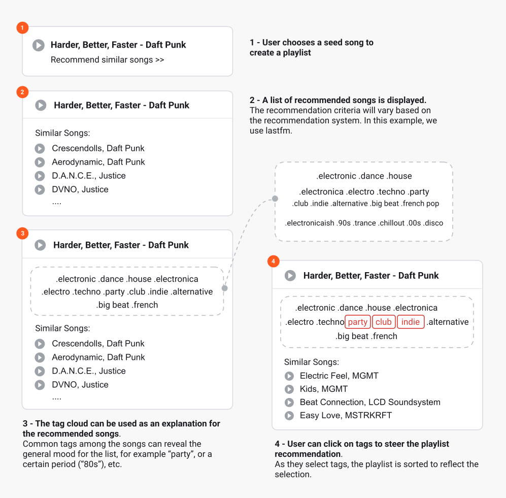
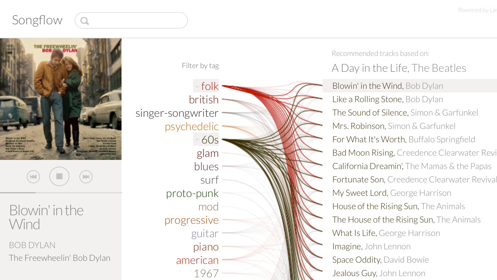
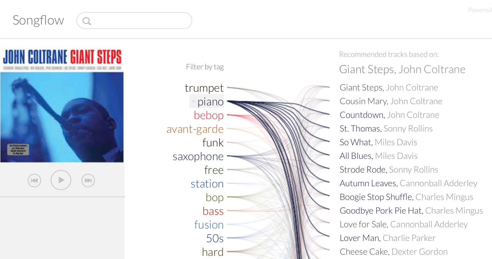
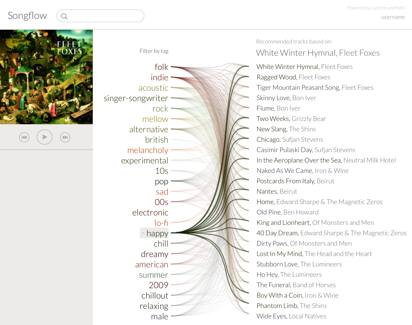
Songflow emerged from this exploration. Tags appeared alongside recommended tracks, with lines making the relationship between attributes and individual songs explicit. Users could begin with a seed song, receive a set of recommendations, inspect the attributes shared across them, and select tags to narrow the results.
Seed song → Recommendations → Explanatory attributes → Refinement
This concept was then refined into the more polished interface shown throughout this case study, sharpening the visual hierarchy and presentation while preserving the underlying interaction model.
How it worked
Songflow was backed by a functional recommendation and data-processing system rather than static prototype data. The system retrieved music recommendations and descriptive tags from the Last.fm API, processed the tag data to identify useful attributes, and connected those attributes to the recommended tracks.
Seed song → Recommendation engine → Recommended tracks → Tag retrieval → Relevance calculation → Visualization → Interactive filtering
The initial recommendation set contained 50 tracks. Songflow presented a subset of the highest-ranked recommendations, but selecting an explanatory tag could surface relevant tracks from deeper in the recommendation set. The processing layer was built in Java and the visualization interface in HTML5 and JavaScript.
As the prototype developed, I also experimented with methods for improving the usefulness of the tag vocabulary. Very common tags such as rock or pop could describe many tracks without helping users distinguish between them. I used inverse document frequency to give more weight to discriminating attributes and reduce the number of tags the interface needed to display.
Explanation as a layer above the algorithm
One of the central questions in the research was what an explanation of a recommendation actually needs to explain.
A conventional collaborative-filtering system might explain a recommendation with something like “People who listen to this also like…” This is transparent to the recommendation mechanism: it tells the user something about how the recommendation was generated.
Songflow took a different approach. It used descriptive attributes such as piano, acoustic, female vocals, britpop, mellow. These attributes were not necessarily the information the recommendation algorithm had used to produce its results. Instead, they helped the user understand and evaluate the output.
This distinction also meant that Songflow could operate independently of the recommendation algorithm underneath it. The explanatory interface could become a layer between an algorithmic system and its user.
Recommendation algorithm → “People who listen to this also like…” → explains something about how the recommendation was generated.
Recommendation algorithm → recommended tracks → descriptive attributes → helps the user understand and evaluate the recommendations.
Testing the interaction
I evaluated Songflow through a series of comparative user studies. The studies examined whether the visualization could improve four aspects of the recommendation experience: scrutability, efficiency, effectiveness, and satisfaction.
Participants completed tasks using functional research prototypes of the interaction model and more conventional recommendation interfaces based on services such as Last.fm and Pandora. These prototypes were visually less polished than the demonstration shown throughout this case study, but implemented the same core visualization and filtering interaction.
The studies measured both task performance and participants’ perceptions of the interfaces. One experiment used a within-subject design with 52 participants, with the order of tasks counterbalanced to reduce carryover effects.
What changed for users
Across the experiments, Songflow performed better than the comparison interfaces on measures related to understanding, evaluation, control, and overall experience.
89% preferred the Songflow explanation over the transparent collaborative-filtering explanation.
94.5% preferred Songflow overall in that experiment.
Reference design: 2.04 / 7
Songflow: 6.35 / 7
Reference design: 2.83 / 7
Songflow: 5.83 / 7
The interaction data also illustrated why. With a conventional recommendation list, someone looking specifically for songs containing piano might need to listen to individual tracks to determine whether each one matched the criterion. With Songflow, piano was visible as an explanatory attribute and could immediately become a filter.
The explanation reduced the amount of individual inspection required to evaluate the recommendation set.
Independent of the recommendation model
I also tested whether the approach depended on a particular recommendation algorithm. One set of experiments used Last.fm recommendations, treated as collaborative filtering. Another used Pandora recommendations, whose Music Genome Project used a content-based approach.
The explanatory interaction remained the same:
Recommendation model → Algorithmic output → Explanatory interface → Human evaluation and control
This separation was important: the visualization was not intended to visualize one particular recommendation algorithm. It was designed as a human-facing layer for making its outputs easier to understand and manipulate.
Note: this project is called Tag Strings in the original thesis. Songflow is the name used across this portfolio for the polished version of the same design and interaction model, and is used throughout this case study for both.