explainable ai explorer
Project
An explanation isn’t the same as understanding. This project explores how interaction and data visualization can help people inspect, compare, and reason about AI predictions.
Target Users
Product partners and domain experts collaborating with ML teams to evaluate whether AI outputs make sense before they’re trusted or shared.
Pain Points
AI predictions can come with technically valid explanations that still don’t help people understand what the model is doing, or how much to trust it.
Move from model explanation to human understanding.
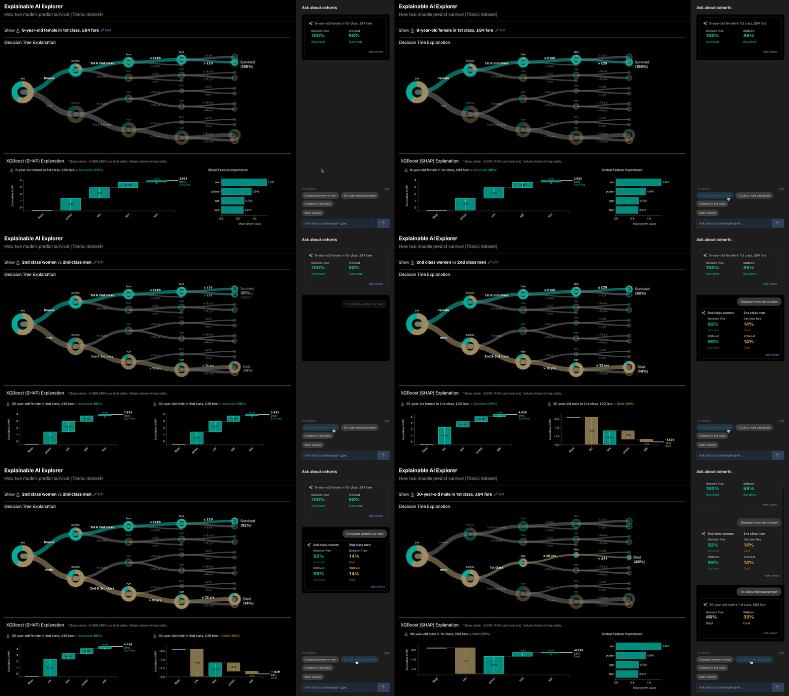
The Explainable AI Explorer is a collaborative review layer that sits between AI systems and the people who need to trust their output. It walks users from prediction to explanation, comparison, and context — building toward judgment without requiring anyone to inspect model internals directly. The prototype uses the Titanic dataset as a familiar, low-risk stand-in for higher-stakes domains like healthcare and finance, where product partners and domain experts need to inspect individual predictions, compare cases, recognize patterns, and bring their own domain knowledge into the evaluation before an AI output is trusted or shared.
Hosted on Hugging Face Spaces. It's running the actual model rather than a recorded demo, so expect a slower first load while it spins up.
- Side-by-side predictions from two AI models for the same passenger
- Key contributing factors surfaced for each model
- Cohort-based context to reveal patterns beyond individual cases
Two Ways to Read a Prediction
Different explanation techniques expose different aspects of model behavior. A decision tree can make a sequence of rules visible; SHAP can show how individual features contributed to an outcome.
The design places these explanations in a shared interactive environment so users can move between them rather than interpreting each visualization in isolation. The goal is not simply to expose more information, but to help people form and test an understanding of why a prediction occurred.
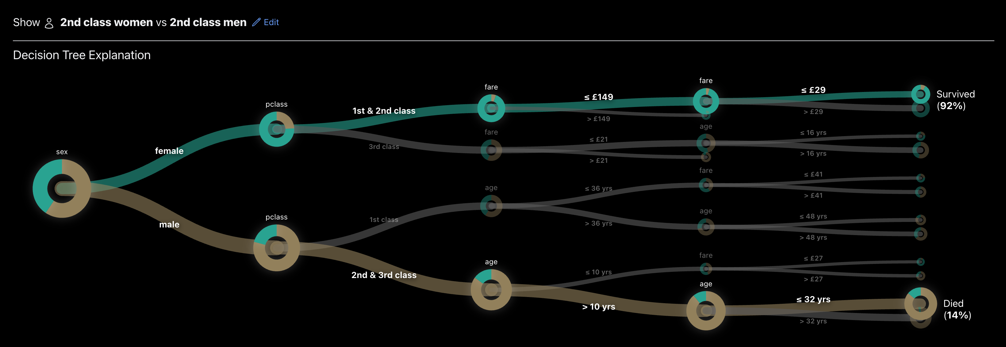
Decision Tree — Transparent Rules. The decision tree exposes transparent, rule-based logic. To avoid overwhelming users, the visualization highlights the active decision path while keeping other branches visible as contextual reference.
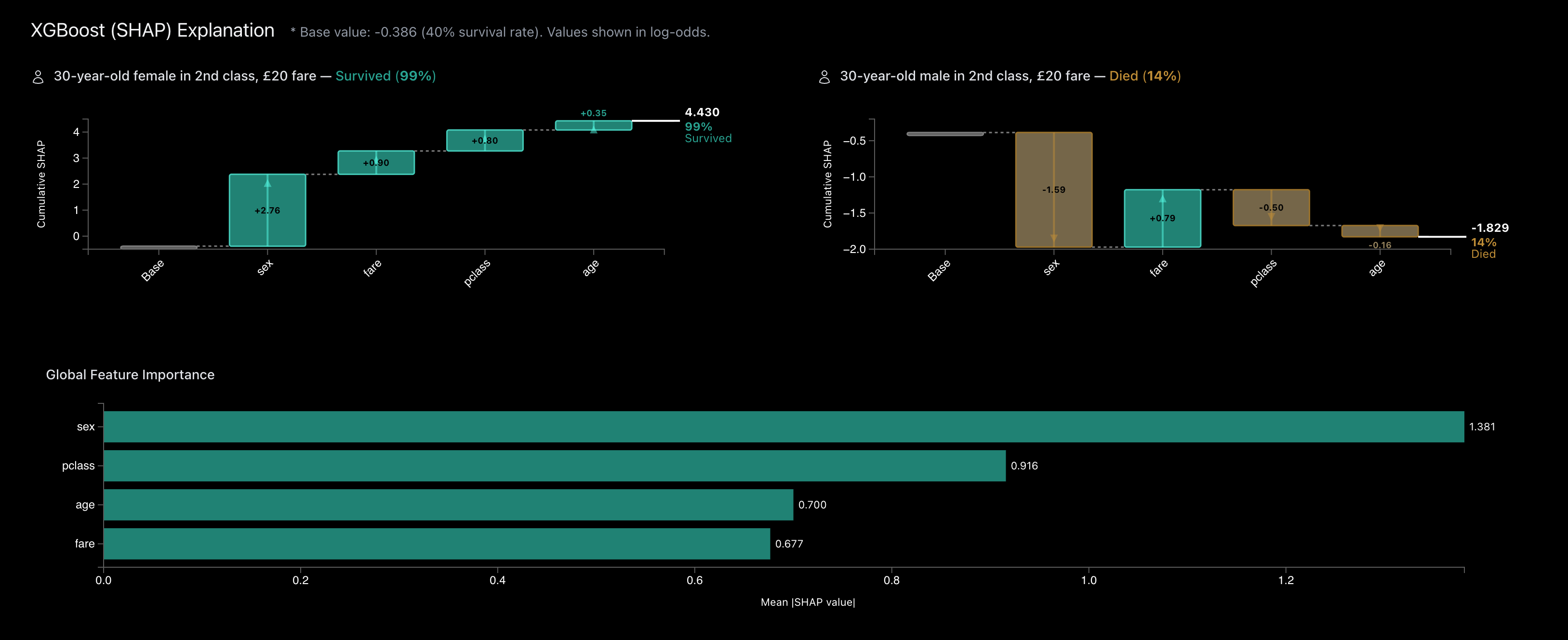
SHAP Waterfall — Feature Contributions. A SHAP waterfall chart shows how predictions evolve from a shared baseline, revealing how each feature pushes the outcome up or down.
- Consistent color palette across models to preserve semantic meaning
- Linked highlighting for direct comparison
- Left-to-right layout to align tree and waterfall reasoning
- Clickable tree nodes redefine cohorts through visual interaction
Individual explanations answer why a model produced a particular prediction. Cohort exploration adds another layer: is this behavior consistent across similar cases, what changes when a variable changes, and is the result part of a meaningful pattern or an isolated outcome?
A working prototype, not a static demo
The explorer is connected to actual predictive models rather than simulated interface states. Changes to passenger attributes generate new predictions and explanations in real time, making it possible to use the interface itself to probe model behavior.
The prototype combines a Decision Tree and XGBoost model with SHAP explanations. Interactive D3 visualizations connect those outputs to the interface, while the What-if tool lets users change variables, compare two scenarios, and immediately see how the models respond.
This was important to the design process: questions about explanation, comparison, and interaction are difficult to explore convincingly when the underlying model behavior is static.
Built with: React · D3.js · FastAPI · scikit-learn · XGBoost · SHAP · Claude Code
Layering Conversation on Top of Analysis
Traditional dashboards require users to manually assemble insights from static views. This design introduces a structured conversational layer integrated directly into cohort exploration.
Visualization provides the evidence; conversation helps users navigate that evidence. Users can trigger comparisons, explore scenarios, and surface model-driven patterns through chat — while visualizations and controls remain the operational foundation.
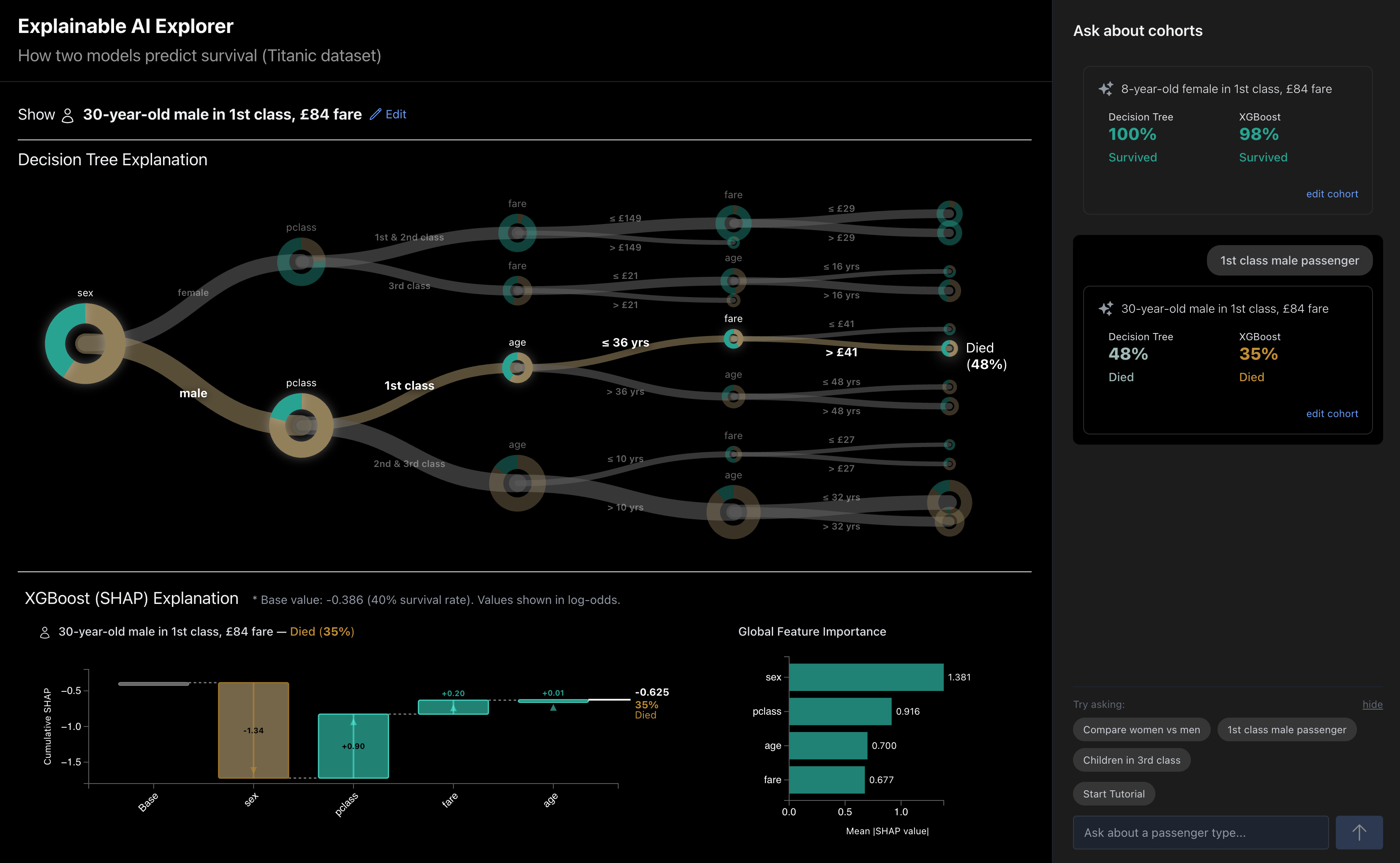
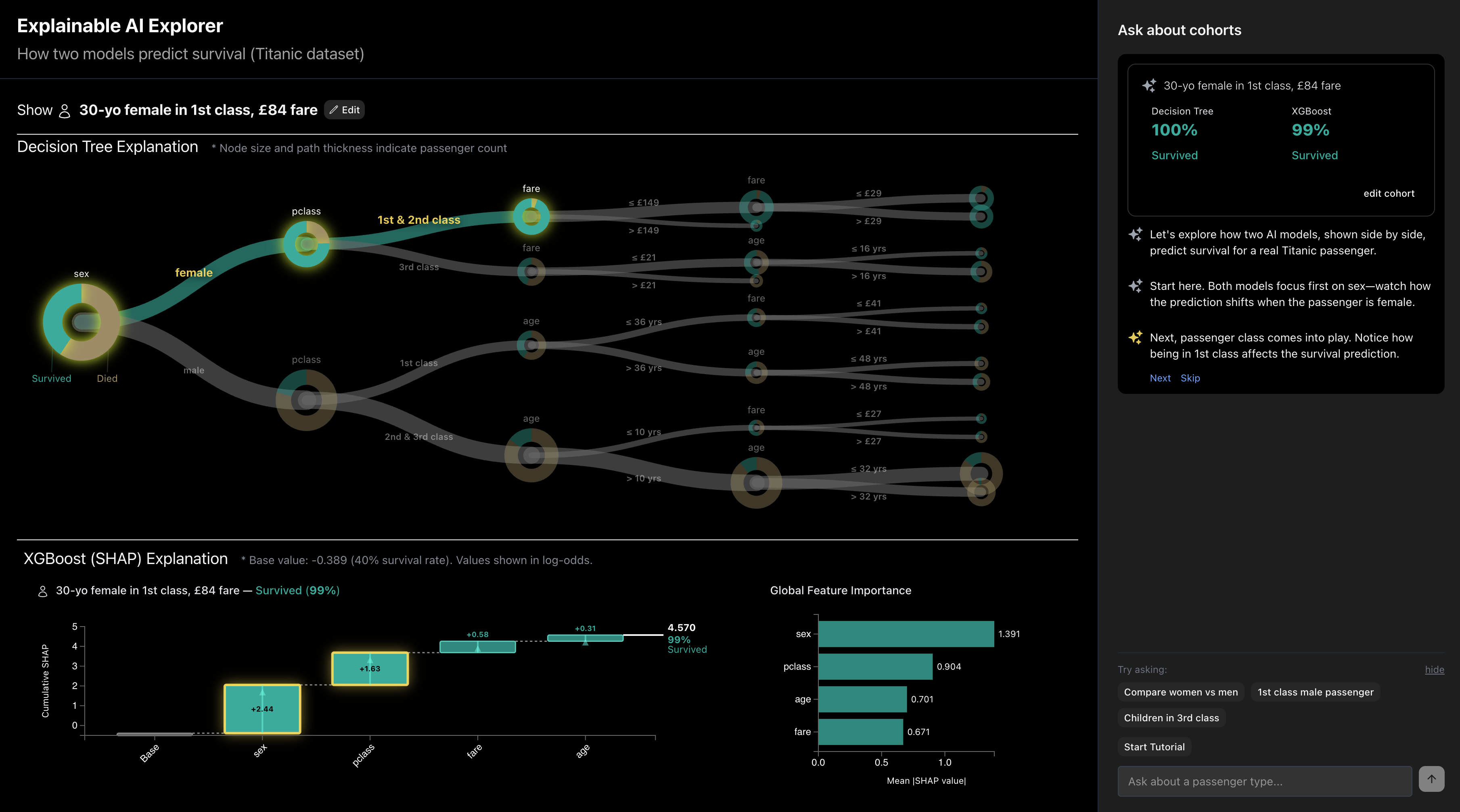
- Chat prompts step through a prediction one feature at a time
- Highlighted nodes and SHAP bars stay synchronized with the current chat step
- Users can jump ahead, skip, or return to manual exploration at any point
- Conversation augments — not replaces — traditional dashboard workflows
From Explainability to Understanding
This project began as an exploration of Explainable AI, but it raised a broader design question: what does an explanation need to do for someone to actually understand and act on it?
Many XAI techniques focus on exposing information about a model — feature importance, decision paths, confidence, or local explanations. But people still have to interpret those representations, connect them to context, recognize meaningful patterns, and decide what they imply.
That gap between making model behavior visible and making it understandable is the research direction I am continuing to explore: how visualization, interaction, and AI-mediated narrative can support the transition from decoding an explanation to forming a contextual understanding of what it means.